Housing Disparity in Toronto Wards
Representing issues with the power of data. A project made for GBDA303.


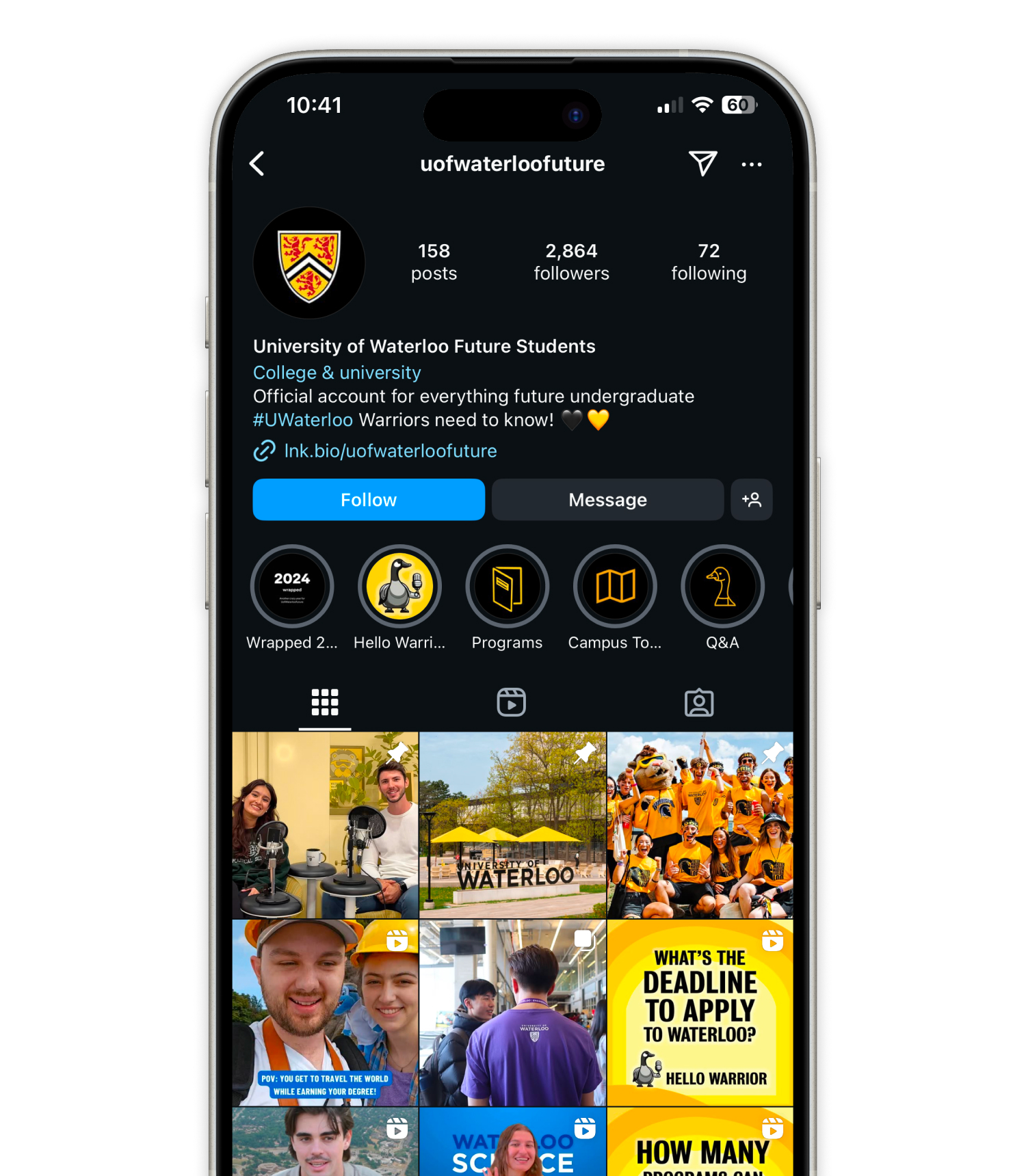
What is Marketing & Undergraduate Recruitment?
Transforming Recruitment Through Social Creativity
I developed and implemented data-driven content strategies targeting a diverse audience of over 100,000 📈 prospective students globally. My initiatives resulted in a 18% increase in social media engagement within one month.
Video Production & Editing
As the film production editor 🖥️ for the university's official podcast, I enhanced its storytelling through engaging video and audio content, expanding its reach to a global audience.
Trend Analysis & Innovation
Staying ahead of industry trends was key 🔑 to my success. I crafted tailored campaigns that resonated with international markets, ensuring our messaging was both impactful and culturally relevant.
Platform Management
I managed content across platforms such as YouTube, Instagram, and Spotify, optimizing reach and engagement 👀 for prospective students.


Designing Impact
Given the large size of UofWaterloo’s booth at the Ontario University Fair, I designed digital signage and motion graphics to strategically fill the space and create a visually cohesive experience. By using the expansive area, I was able to showcase Waterloo's innovative spirit with large-scale, attention-grabbing visuals that immediately drew visitors 🚶 in and set the tone for an immersive exploration of the university’s offerings.
Dynamic Student Experience
I designed graphics that showcased the university’s dynamic, interdisciplinary student experience, highlighting how Waterloo blends multiple fields of study 📚. These designs helped communicate the breadth of opportunities available at Waterloo, drawing in students interested in a multifaceted education.
Engaging Visuals
The motion graphics I developed were integral in capturing the visitors’ attention. The vibrant and interactive designs not only highlighted Waterloo's strengths but also encouraged deeper engagement 😀 with the booth, making the experience memorable for attendees.
Forward-Thinking Education
By creating visuals that emphasized Waterloo’s innovative approach to education, my designs reinforced the message that the university is a leader in offering cutting-edge, future-focused programs ⭐. These designs contributed to the booth's success, helping generate significant interest and excitement among prospective students.
5 million views and counting...
Conducted extensive research to understand current trends in international student recruitment, ensuring the campaign resonated with a global audience on Instagram.
Creative Composition & Visual Design
Crafted a dynamic, attention-grabbing composition using engaging visuals that highlighted the top 5 reasons to study in Canada, effectively conveying key messages in a concise and appealing format.
Strategic Editing for Social Media Impact
Edited the short reel with a fast-paced, engaging flow, optimized for Instagram’s platform, ensuring it captured attention quickly and maintained viewer engagement throughout.
Performance Optimization & Engagement Growth
Leveraged insights from audience interaction to optimize the campaign, contributing to an impressive 5 million views and significant engagement across international markets.

Bringing Ideas to Life
“He is pleasure to work with, bringing his enthusiasm, creativity and attention to detail to every project he worked on. His technical skills in design and video production are excellent, and he’s a great problem solver with many innovative ideas.”

More content for your eyes.
Project Overview
Our objective was to create a comprehensive branding package that would modernize Cinnabon's image while preserving its nostalgic charm.

Research and Discovery
Quality
Whimsical
Irresistable
This analysis informed our design direction, ensuring alignment with Cinnabon's mission to "spread warmth" and its core values of community and family.


Design Approach
Introducing a squishy, indulgent wordmark to convey friendliness and sweetness, reflecting the irresistible nature of Cinnabon's products.
Icon Incorporation
Reintroducing the cinnamon swirl icon from the 1985 logo to honor the brand's heritage and emphasize its history.
Playful Imperfection
Designing an imperfect logo to mirror the handcrafted quality of Cinnabon's cinnamon rolls and maintain a playful tone.


Video Commercial Creation
The commercial gave me the opportunity to see how brand elements—such as the new logo, color scheme, and typography—come to life in motion. I learned how these elements need to work seamlessly together to maintain a consistent and dynamic brand presence across different media formats.
Impact on Brand Image
Through the video, I realized how moving visuals can significantly elevate a brand’s image and convey its personality in a more dynamic, engaging way than static images alone.
Balancing Modern Design with Heritage
I learned how to incorporate a modern touch into a beloved, traditional brand while respecting its legacy. This process taught me the importance of preserving a brand's core identity while evolving to meet contemporary consumer expectations.


Implementation and Impact
Modernizing the visual identity to attract a wider audience while retaining loyal customers.
Strengthen Market Position
Reinforcing Cinnabon's core values and nostalgic appeal to differentiate it from competitors.
Drive Sales Growth
Creating a compelling brand presence that resonates with consumers and encourages increased patronage.


Now for a commercial break...

Introduction
Reflection
The analysis of affordable rental housing distribution across Toronto wards reveals significant disparities in housing availability and socio-economic conditions. Wards like Toronto Centre (32 units), Fort York (23 units), High Park (18 units), and Weston (18 units) have a high number of affordable rental units. This high concentration suggests that these areas might have better access to affordable housing resources, which could be due to targeted housing policies or higher demand for such housing. On the other hand, wards such as Black Creek (1 unit), Don Valley West (1 unit), Lawrence (4 units), and Willowdale (1 unit) show significantly lower numbers of affordable rental units. This disparity indicates potential gaps in affordable housing availability and might reflect higher property values, less demand for affordable housing, or limited development of such units in these areas. When assessing the current number of active divisions being established we see the clear discrepancy between the number of people who are on the waiting list compared to actual number of divisions available. Size doesn’t seem to matter for this issue and most of these affordable housing units seem to reside lower Downtown, Toronto.
While keeping in mind not to overdue the infographic with text, visual aid was added alongside each fact point and important statistics are clearly highlighted depending on their meaning. Bar charts and block charts were employed to represent the number of affordable housing divisions per ward and the area distribution within these wards. Bar charts enable easy comparison across stages, while block charts effectively illustrate proportional data, such as the number of affordable divisions which makeup of different wards. The colours were chosen were to be able to recognize and emphasize the important needs of each ward. Visuals are meant to clearly paint a picture of what the according scenario looks like.
The insights from this research can guide policymakers in identifying wards that require increased support and intervention. For instance, wards with high affordable housing needs but low availability can be prioritized for new housing projects. Urban planners can use this data to develop balanced, inclusive communities by addressing the disparities in housing distribution and socio-economic conditions. Researchers can build on this data to further explore the root causes of housing disparities and their socio-economic impacts. Advocacy groups can use the findings to lobby for policy changes, highlight issues of inequality, and drive public awareness campaigns focused on housing justice and urban equity. Non-profit organizations and community group scan leverage these insights to tailor their support programs. For example, areas identified with high socio-economic support needs can benefit from targeted initiatives such as job training programs, financial literacy workshops, and affordable childcare services. This ensures that resources are allocated effectively to where they are most needed.
In conclusion, the analysis of affordable rental housing across Toronto wards, visualized through a block chart, reveals significant disparities in housing availability. These insights can inform policy decisions, guide urban planning, and support community organizations in their efforts to address housing inequality. By targeting areas with the greatest need, stakeholders can work towards a more balanced and equitable housing landscape in Toronto.

